March 25, 2014

Mix-Use Model Project

This was the final project for a design studio class that I was taking last semester. For this project, I had to design and construct a model for a mix-use development. A mix-use development can be a single building or a walkable neighborhood that blend residential housing with commercial businesses. I had to design a three-story building consisting of a store front on the street level, with two high end urban lofts on the second and third floors, and ending with a roof top terrace. I have always like the idea of repurposing a preexisting warehouse over demolishing and rebuilding something new. So my design was based on the idea of repurposing an industrial building made out of brick on the exterior facade and exposed brick on the interior open floor plan. The ground floor was designed for a dessert shop while the second and third floors were designed as urban style lofts. Each loft has an open floor plan that combine the living room with the dining room and kitchen off of the front entry. There is also a back entry that residence can take from their garage up to the loft. I infused character and charm by adding an inglenook with a fireplace, the third bedroom off the living was created into flex room, sunroom with green walls, a brise soleil system off the back balcony, and curving the walls of the hallway into each loft. For the model, I designed each floorplan on AutoCAD, which was then imported into Corel to be cut by a laser cuter on a piece of birch plywood. I also got the chance to designed two sets of custom stairs in Revit, which were then printed on a 3D printer. Finally, the curved walls were constructed out of thin popsicle sticks. After just completing one architecture course over the summer, I never thought that I was capable of designing and constructing a full architectural model at the end of last semester.

East Elevation  ||  West Elevation
   
North Elevation
South Elevation
Floorplan
   

December 31, 2013

Paris Nights / New York Mornings


Wishing everyone a Happy New Year!
Thank you to all of my readers who have made 2013 a memorable year for me.
With my passion for design and your help in sharing my projects,
Whimzeecal would not have been such a success. So thank you again!

November 6, 2013

Origami T-Rex Project

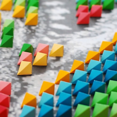
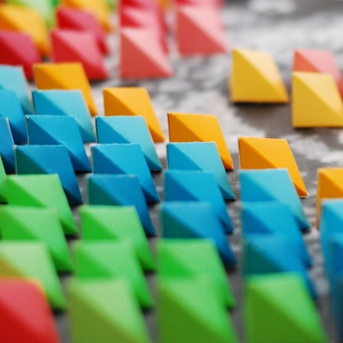
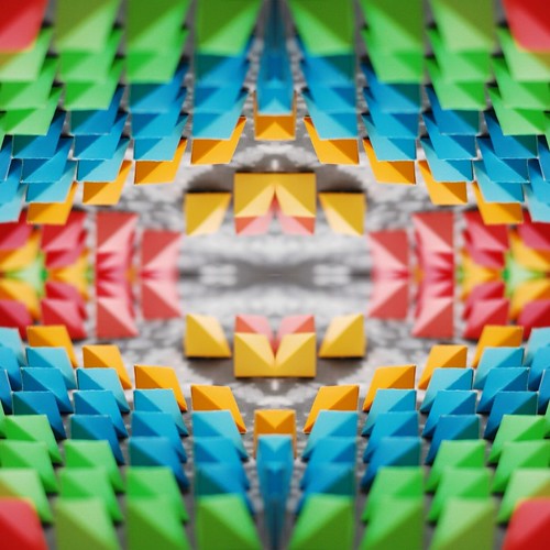
I just completed the sixth project for a design studio class that I am currently taking. For this project I had to demonstrate color and texture through the use of a bas-relif. A bas-relif is a sculpture that is slightly raised in elevation, resulting in a 3-dimenisonal image. I had the option of using plaster of paris, paper mache or drywall spackle in order to create my bas-relif. But my outside-of-the-box thinking kind of mind was fixated on coming up with an alternative technique. After doing some research, I came upon the beautiful origami mosaic of artist Kota Hiratsuka and knew that I wanted to create an origami bas relief. In order to infuse a vary of different color into my project, I decided to use paint chip stampes (the kind that you get at any home improvement store) and cut them into 1 inch stripes. After trying out different types of folds, I was able to come up with a six sided hexagram. The next step was to find the right image to form my bas relief. With a workspace limited to a foam core board of 15"x15", it was hard to create a recognizable image, that was not otherwise abstract, out of the hexagrams. I finally decided upon a pixelated image of a T-Rex which looks like he is jumping out of the page. Since part of the image captures that 3-dimensional element, I only had to cover part of the image with the hexagram to capture the rest. The result is a single image which captures the interplaying between 2-D and 3-D color and texture.

Trex1   Trex2
Trex3   Trex4

October 23, 2013

Color Theory Pattern Project

225 SQ | 900 SQ | 3600 SQ | 32,400 SQ


I just completed the fifth project for a design studio class that I am currently taking. For this project I had to demonstrate color theory and pattern language. The task was to use 8 related colors that exhibit the concepts of tint, shade and tone. But I also had to demonstrate how 5 harmonic colors exhibit the pattern of either complementary, analogous, or tetradic square color schemes. First, I had to choose 5 related colors that demonstrate the progression of that color. I chose a minty green as a base color and went two shades darker and lighter in tint and tone to show the progression. Second, I had to choose 3 harmonic (contrasting) colors that are different in hue and needed to be distinctly patterned in relation to each other on the color wheel. I went with brown, peach and yellow to because I felt that it would complement the 5 shades of green. Thirdly, I had to apply these colors into a mathematical, musical or abstract theory pattern that projects pattern language. I went with a modern abstract pattern that projects calmness and simplicity yet it leaves room for collaboration and interoperation.
The only medium that I could use for this project were paint color chips that you can get at any home improvement hardware store. After a trip to Home Depot, I went home with small stack of Behr color chips. The craftsmanship that went into the project was to precisely cut out 1" squares of each color and glue them on to a 15x15" foam core board, which would give me a total of 225 squares. The final product is what you see in the upper left hand photo. I decided to take the project one step further to see what kind of pattern I could produce if I took the photo and tessellated it. The results blew my mind because through some simple flips and rotations of the original photo I was able to create some beautiful design patterns. The photo on the upper right was created by taking the original photo and tessellating it over 4 squares (225 sq x 4 sq), which gives us a total of 900 squares. The photo on the lower left was created by taking the previous photo and tessellating it over 4 squares (900 sq x 4 sq), which give us a total of 3600 squares. Finally, the photo on the lower right was created by taking the previous photo and tessellating over 9 squares (3600 sq x 9 sq), which gives us a total of 32,400 squares. I am in love the final product and could see it as floor tiles in a Spanish Style house. Below are the fabulous works that some of my classmates have created. I took a photo of it and tessellated it to create some wonderful patterns.

ANNA


DOROTHY


EMILIA


MARCUS


STEVE


FRANCISCO

October 10, 2013

Elephant Parade

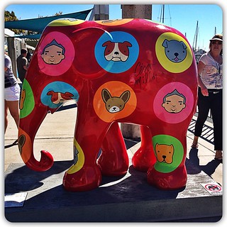
The Elephant Parade have finally come to America! After touring the world and visiting some major cities such as Amsterdam in 2009, London in 2010, Milan in 2011 and Hasselt in 2012, they are now in sunny Southern California. Displayed throughout the beach city of Dana Point, finding them can be a wild yet exciting scavenger hunt. I spotted six down in Dana Point Harbor. I tired my best to capture the artistic beauty of each painted elephants, but it not the same as seeing the each one up close and personal. Each elephant convey a story of love, support and hope for humanity while bringing happiness and joy.
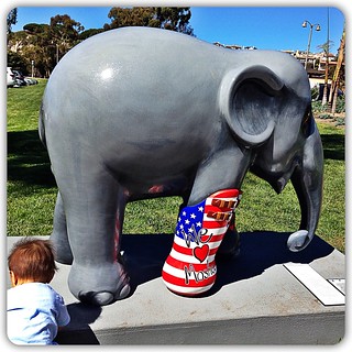
We Love Mosha USA

WE LOVE MOSHA | USA

Artist: Thiti Suwan
Location: Dana Point Harbor (Harbor Entrance)
Story: "Mosha, a baby elephant, stepped on a landmine and lost her lower right leg. In need of urgent intensive care, she was rushed to the Friends of the Asian Elephant Hospital in Thailand. While visiting the hospital, Marc Spits met baby Mosha and was inspired to create Elephant Parade. At the hospital, doctors healed Mosha so that she could walk with a prosthetic leg."


Cesar's Park

CESAR'S PARK

Artist: Cesar Millan
Location: Dana Point Harbor (East Basin Walkway)
Story: "Cesar’s Pack is dedicated to the idea that the human-animal interface is a complicated one. Understanding each others’ needs without a common language takes effort, to serve and protect. Communicating heart-to-heart. Soul-to-soul. On a planet we share. Mankind must take the leadership to save all creatures."


Brittany

BRITTANY

Artist: Loree Rodkin
Location: Dana Point Harbor (East Basin Walkway)
Story: "Inspired by a life filled with creativity and beauty, Ms. Rodkin designed an elephant whose armor grows when in danger. A masterful realization by Skinny Lewis."
Note: The best feature about this elephant are her beautiful "feathered" eyelash. It shows that we can all be strong and feminine at the same time.


Sea The Point!

SEA THE POINT!

Artist: Laura Seely Rodkin
Location:  Dana Point Harbor (Dana Wharf)
Story: "Uniting for a global cause - that's the point of this majestic harmony between the elephant and the whale. The world's oceans connect us all and unifying the largest mammals of land and sea sheds light on the mission to create awareness of the critical plight of the Asian elephant, as well as Dana Point's continuing commitment to local and global conservation."


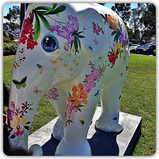
Maa Lii

MAA LII

Artist: Chris Chun
Location: Dana Point Harbor (Harbor Entrance)
Story: "This elephant inspires recognition of the natural abundance and beauty. Flowers are an integral part of Thai Culture and are used in floral garlands to pay respect to Buddha. They are also presented and worn at many festive and happy occasions. Maa Lii is an ancient Thai word for “flower blossom” and represents the hope that the elephant will blossom again."


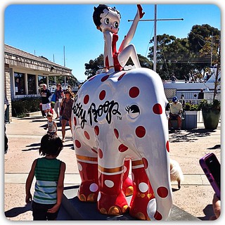
Betty Boop

BETTY BOOP

Artist: Max Fleischer D. 1972
Location: Dana Point Harbor (Dana Wharf)
Story: "Betty Boop has captured the heart of this elephant with her wide-eyed and alluring personality. Decorated with red and white polka dots and metallic gold trim, the elephant gazes at her with a sweet smile. A 1930’s depression era creation, BB gave hope to people deal with life’s struggles. When first introduced, Betty Boop was a dog catcher! Saving animals even then."

September 18, 2013

Celeritatis Project


I just completed the third project for a design studio class that I am currently taking. For this project the professor had us select a Latin word at random and the word is supposed to define a concept that does not have a simple visual icon to illustrate it. Our job was to clearly communicate the meaning of the word through an image but we are only allow to use the letters in the Latin word to create this image. The word that I got was "celeritatis," in Latin, which means "swiftness," in English. The first few images that came to mind which represents swiftness is a river, a runner or a leopard. I decided to go with a runner because I thought it would be interesting to try and make it look like a Nike ad.
On my first attempt, I drew a person running so fast that you can see the movement lines that they are leaving behind, and from within those lines I was going to incorporate the word "celeritatis." It is the first image that you see above. I painted a 10" x 20" chipboard in black acrylic paint and then drew the image using a silver metallic Sharpie. The boldness of the silver image projected on the black background captured speed, acceleration and rapidness. With this first image, I was able to capture the Nike ad feel that I was going for, however I did not use my word in the correct way.
On my second attempt, I decided to simplify the concept of running by incorporating the word into an image of a tennis shoe and follow it up with three movement lines made out of the word to represent swiftness. It is the second image that you see above. I captured movement by putting the letters so that it flow as you read it from right to left and it represent that the shoe is running forward. With this second image, I had a lot of fun with typography where as the first image I had more fun with sketching. In general, both images makes a bold statement and I will have them printed on a t-shirt if I ever run a marathon.

September 12, 2013

Mountains and Feathers Project

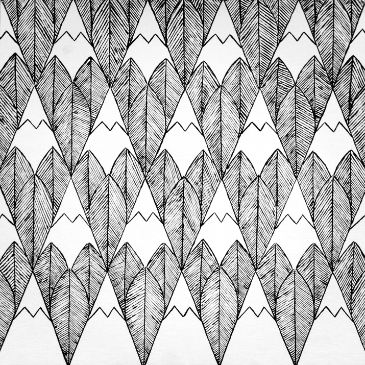
FeatherMountain

This is the second project that I've completed for a design studio class that I am currently taking. For this project I had to come up with a positive and negative image, in a black and white pattern, that would increase visual awareness. If you are not familiar with positive and negative images then you need to checkout the work of famous Dutch graphic artist M.C. Escher and modern day Malaysian graphic artist Tang Yau Huoong. Generally, positive space is easy to spot because it is the space that is occupied by the object that we are looking at. The negative space, on the other hand, is the space around the object and often time it is not easy to spot because it could be completely bounded by the positive space.
I had a lot of difficulties coming up with an image that would incase another image. I knew that I wanted to combine Native American patterns with patterns found in nature. I decided upon the pattern of mountain ranges, which represents the nature, in the positive space, and the pattern of feathers, which represents Native American art, the in negative space. I then took both images and tessellate them because that would capture the pattern language and repetition that are often found in Native American art and nature. After twelve hours, two paint brushes and one achy back later, I've painted the pattern on a 20" x 20" chipboard.
The more I look at it, the more objects I can pull from it. There are a handful of noticeable objects, such as mountains/teepees, leaves/feathers, arrowheads and spearhead. And there are a few not so noticeable objects that could be decipher, such as the mountain resemble Mount Fuji or a pencil head and the repetition of the top of the feathers resemble waves. In general, this was one of the more difficult project that I've completed but the finished product got the wheels in my head turning as how to take the pattern and create textile out of it. If you have tips on to how to transfer this pattern onto fabric, please contact me or leave me a comment. I would love some feedback. Overall, the purpose of this project was to demonstrates theories of positivism and void in design and cognitive reversal of image.

September 5, 2013

Clarity


High dive into frozen waves where the past comes back to life,
Fight fear for the selfish pain, it was worth it every time,
Hold still right before we crash 'cause we both know how this ends,
A clock ticks 'til it breaks your glass and I drown in you again,

'Cause you are the piece of me I wish I didn't need,
Chasing relentlessly, still fight and I don't know why,

Walk on through a red parade and refuse to make amends,
It cuts deep through our ground and makes us forget all common sense,
Don't speak as I try to leave 'cause we both know what we'll choose,
If you pull then I'll push too deep and I'll fall right back to you,

If our love is tragedy, why are you my remedy?
If our love's insanity, why are you my clarity?

-CLARITY-

August 28, 2013

Painted Cube Project

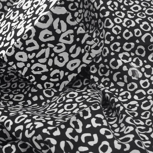
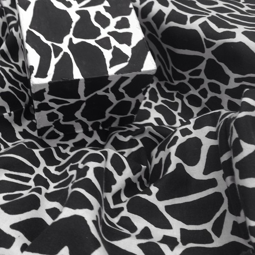
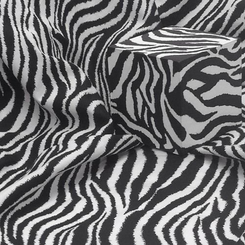
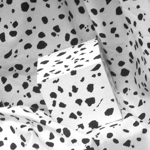
Painted Cube 1 Painted Cube 5 Painted Cube 4 Painted Cube 3 Painted Cube 2 Painted Cube 6
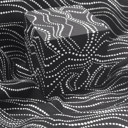
The photo on the top left is of my cube. The rest of the photos are of the cubes of my talented classmates in ARCH 218 in Fall 2013.

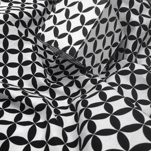
I am in the second week of the Fall semester and just completed the first project for a design studio class that I am taking to help beef up my portfolio. For this first project I had to take a black and white printed fabric and paint it onto a 4" x 4" cube, taking into consideration the folds and creased that the fabric creates when it is crumpled up. At first glance, the project sound super difficult. But after careful consideration of fabric pattern and my own artist capability up to this point, I decided upon an abstract dot pattern over a floral fabric pattern. While working on this project, I discovered how to merge the cube with the fabric pattern so that they become one. First, I noticed that the dots on the fabric pattern all ran in one direction so I decided to paint the pattern so that it ran both horizontally and vertically on the cube in order to capture the wrinkles and folds of the fabric. Second, I discovered that by painting the pattern so that it wraps around the sides of the cube helps eliminate the sharp edges of the cube. In the photos above, you can see how at least one, two or even three sides on the cube disappear into the pattern on the fabric. So the question is did I turn the fabric into the cube or did the cube turn into the fabric? Overall, the purpose of this project was to understand how negative and positive space lay within our visual perception and how it makes us think twice about how we perceive our surrounding environment.