


I just completed the third project for a design studio class that I am currently taking. For this project the professor had us select a Latin word at random and the word is supposed to define a concept that does not have a simple visual icon to illustrate it. Our job was to clearly communicate the meaning of the word through an image but we are only allow to use the letters in the Latin word to create this image. The word that I got was "celeritatis," in Latin, which means "swiftness," in English. The first few images that came to mind which represents swiftness is a river, a runner or a leopard. I decided to go with a runner because I thought it would be interesting to try and make it look like a Nike ad.
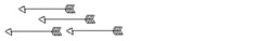
On my first attempt, I drew a person running so fast that you can see the movement lines that they are leaving behind, and from within those lines I was going to incorporate the word "celeritatis." It is the first image that you see above. I painted a 10" x 20" chipboard in black acrylic paint and then drew the image using a silver metallic Sharpie. The boldness of the silver image projected on the black background captured speed, acceleration and rapidness. With this first image, I was able to capture the Nike ad feel that I was going for, however I did not use my word in the correct way.
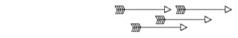
On my second attempt, I decided to simplify the concept of running by incorporating the word into an image of a tennis shoe and follow it up with three movement lines made out of the word to represent swiftness. It is the second image that you see above. I captured movement by putting the letters so that it flow as you read it from right to left and it represent that the shoe is running forward. With this second image, I had a lot of fun with typography where as the first image I had more fun with sketching. In general, both images makes a bold statement and I will have them printed on a t-shirt if I ever run a marathon.
On my first attempt, I drew a person running so fast that you can see the movement lines that they are leaving behind, and from within those lines I was going to incorporate the word "celeritatis." It is the first image that you see above. I painted a 10" x 20" chipboard in black acrylic paint and then drew the image using a silver metallic Sharpie. The boldness of the silver image projected on the black background captured speed, acceleration and rapidness. With this first image, I was able to capture the Nike ad feel that I was going for, however I did not use my word in the correct way.
On my second attempt, I decided to simplify the concept of running by incorporating the word into an image of a tennis shoe and follow it up with three movement lines made out of the word to represent swiftness. It is the second image that you see above. I captured movement by putting the letters so that it flow as you read it from right to left and it represent that the shoe is running forward. With this second image, I had a lot of fun with typography where as the first image I had more fun with sketching. In general, both images makes a bold statement and I will have them printed on a t-shirt if I ever run a marathon.

No comments:
Post a Comment